01 March at 07:00AM
Never Struggle to Make Sense of Your Business Data Again

Take advantage of Tableau Public, a powerful tool for data analytics and visualization and create supporting documents for your projects. At PMI Toronto’s January Chapter meeting our guest speaker, Carol Donohue, explained how she became a Tableau Public guru and how it helps in project & program management. The evening’s event was moderated by Karthik Srinivasan. The discussion was an interactive and interesting session that made data analytics a PM tool everyone should have in their CV!
Introducing Our Guest Speaker

Carol Donohue has been a project and program manager for over 25 years. In 2018 she transformed her program management database tools into a Tableau data visualization for managing risk in program delivery. She has since pivoted into the world of data science.
Overview
Carol shares four key points:
1. Stakeholder management impacts the success of data analytics
2. Understanding data analytics
3. Understanding data visualizations
4. How to use Tableau Public to create your own data analytics and visualizations
Carol uses the graphic and visual-based outputs to manage risks for her clients, digging deeply into data analytics and visualizations to uncover insights and drive change.
Tableau Public is a free online tool for anyone interested in understanding data and sharing those findings in a visual way. Tableau Desktop, a licensed software is often used in business intelligence or for data analysis.
Stakeholder Management
First, Carol walked us through why stakeholder management is important when we think about introducing a data visualization tool like Tableau. She stressed the importance of knowing your audience. Carol recommends starting with a SWOT analysis as a tool and focus on the threats facing your project. Construct a SWOT analysis with the stakeholders in mind.
Working with the customer in mind, we need to understand just what the stakeholders are looking to get out of analytics and visualizations. Some of the questions stakeholders may ask includes:
- What’s in it for me?
- How do we compare to our peers?
- Do any of our company resources have the ability to be a project champion?
- Who will our super-users be?
- What are our cultural or behavioural biases?
If, for example, the project champion in your client company, is the person you can build a close working relationship with and ensure your data visualization tools suit their needs. You could also use this tool and have it integrated with other software or tools your clients or organization may use.
Data Analytics
Let us first understand what data analytics means and why you would use it within your project.
Carol explained that data analytics and the project’s purpose work to analyze raw data and draw conclusions. This will assist your stakeholders by:
- Optimizing business performance
- Reducing costs
- Gaining efficiencies
- Making better business decisions
- Analyzing customer trends
- Enhancing customer experience
- Offering a better product or service mix
This is our “why” behind a client engagement. So, what approaches does data analytics offer the project manager?
.png)
Four questions that Carol shares helps us understand the different types of data analytics that can be performed; imagine the customer wants to answer one of the following questions:
- What happened? → descriptive analytics
- Why did it happen? → diagnostic analytics
- What will happen? → predictive analytics
- What is the next best action? → prescriptive analytics
Understanding which of the four questions being asked will then help you select the best graphical visualization of the data.
Data Visualization
What is data visualization? Simply put, this is a method of turning data sets into some graphical representation, where we can better see trends, patterns, or outliers.
Turning raw data or numbers into tables, graphs, or charts helps us break down large data sets into manageable learnings and can help us tell a story.
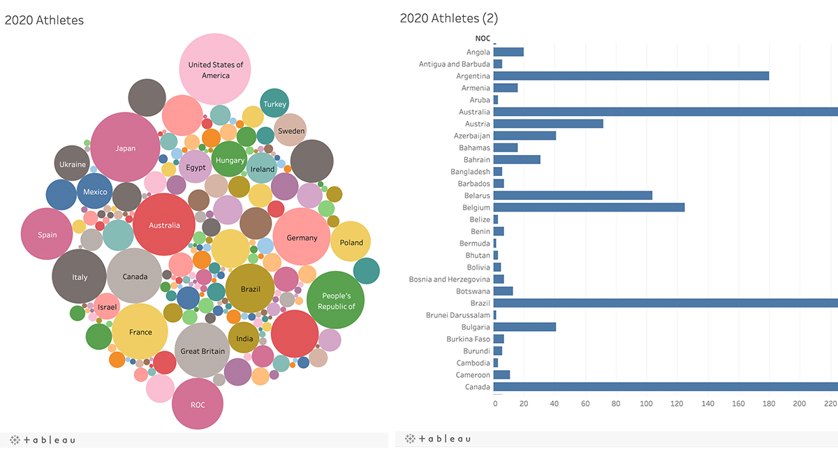
Carol demonstrated a Tableau Public dashboard she created. Instead of a long list of names of athletes who attended the 2020 Tokyo Olympics, you can create a fun and colourful “bubble chart” or a bar chart.
Using Tableau Public
Carol showed the attendees just how easy it is to use Tableau Public. She explored the seven steps required to import your data set and publish your dashboard.
1. Connect your data set.
2. Explore the data.
3. Create your desired visualization.
4. Use “Show Me” to display the visualization.
5. Toolbox: Adjust the visualization to suit your needs.
6. Create your dashboard.
7. Publish on the server.
Concluding Thoughts
Carol shared her thoughts about the value of using data modelling to drive strategic insights. In most cases you get prescriptive and descriptive analytics, but models become more accurate as they undergo multiple uses (e.g., splitting, testing, validating, and fine-tuning). Tableau is an intuitive and compatible software that allows you to share your dashboard or send a private link to stakeholders.
Tableau is better for visually presenting data and telling an impactful story for any project. Tableau Public is a great tool for any project management professional. After learning about its great benefits I can’t wait to try it!


