25 March at 12:30PM
Out With the Old, In With the New PMI Branding
PMI has always been a leading voice in project management, and a lot has changed in the last 50 years from when the organization was first founded. The new demand today for project managers is to be a strategic partner to a complex network of stakeholders and navigate rapidly changing environments. These environmental changes include multiple generations in the workforce, AI and automation, and complex global relationships. Let’s introduce PMI’s new direction ‘The Project Economy’.
The
Project
Economy
Today, the way we work has changed. Organizations and people are centred around a portfolio of projects, creating an economy of projects. PMI calls this new way of working “The Project Economy.” The Project Economy is one in which people have the skills and capabilities they need to turn ideas into reality.
It is where organizations deliver value to stakeholders through successful completion of projects, delivery of products, and alignment to value streams. And all of these initiatives deliver financial and societal value.
Along with a new direction, PMI has introduced a new design language that has a new logo, symbols, typography, and colours. It begins with a design language that represents the qualities required to be a part of The Project Economy: Collaboration, determination, change, innovation, teamwork, outcomes, growth, vision and community.
The
Project Mark
And Logo
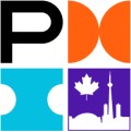
The Project Mark consists of the letter ‘P’ to represent ‘Project’ and symbols from the language of The Project Economy, representing collaboration, determination, and change. PMI knows that a project is everything from the Euro and Google’s search engine to everyday assignments. That’s why they’re elevating “Project” in their mark.

PMI pairs the Project Mark with the “Project Management Institute” wordmark to form the logo. The typographic treatment elevates “Project” by spelling it out, and creates a hierarchy within the wordmark by using the bold weight.

The PMI logo is the most singular visual expression of who they are and we are as Chapters. In April, PMI Toronto will be revealing our new branded website and our own unique PMI Chapter logo. We’ve seen it and it’s amazing! Stay tooned!
The
Symbols
Meaning
As mentioned above The Project Economy is represented by these qualities: Collaboration, determination, change, innovation, teamwork, outcomes, growth, vision and community. PMI represents each of these qualities with a unique symbol, the full set of which creates a design language that will be adopted over time as we gradually begin to familiarize ourselves with the meaning behind each symbol.
These symbols create a consistent design language that represents some of the characteristics needed to be successful in the future. Over time, as we use them in our communications, these symbols will help shape and define The Project Economy and demonstrate PMI’s authority and leadership in this space.
![]()
Educational
Foundation
 You may notice a tenth symbol, the philanthropy symbol is especially developed for the PMI Educational Foundation and unique to this brand. It is not used as a symbol in the pattern graphic. The first letter of the brand name goes in the top left quadrant of the mark. The following three quadrants hold three symbols - philanthropy, collaboration, community.
Making dreams a reality takes more than a vision — it takes action and dedication. PMIef nurtures and inspires the next generation to learn, grow, and achieve their goals so that they too can benefit society. This continued commitment and passion enables us to contribute to the welfare of our youth — and their communities.
Typography
and Colour
Primary
typography

Secondary
typography

GT Pressura Mono is a condensed sans-serif typeface with slab-serif like qualities that brings a technical side to our communications. For information that needs to feel different from body copy, such as quotes or call-outs, Pressura can also be used in these less common instances
Primary
colour palette
PMI’s primary color palette expresses the Brand Personality – fearless\bright, and nurturing – through three core colors: Tangerine, Aqua, and Violet. These colors combined create an approachable and energetic atmosphere, that helps build a recognizable look and feel for PMI.
Applying PMI’s core color palette will build brand awareness by creating a strong connection across all of our brand touchpoints, from our website to event signage. In most cases, our three core colors and black and white should be all you need to make distinct PMI communications.

PMI Toronto
What does all this mean for us? At PMIT, we are embracing this fresh new look and are looking forward to what the next 50 years of project management have in store. More importantly, we look forward to going on this journey with all of our members and aspiring project managers.
Please keep an eye on our website, social media channels, Weekly Scope, and more. Later this month we will make the transformational change to the new branding!


